
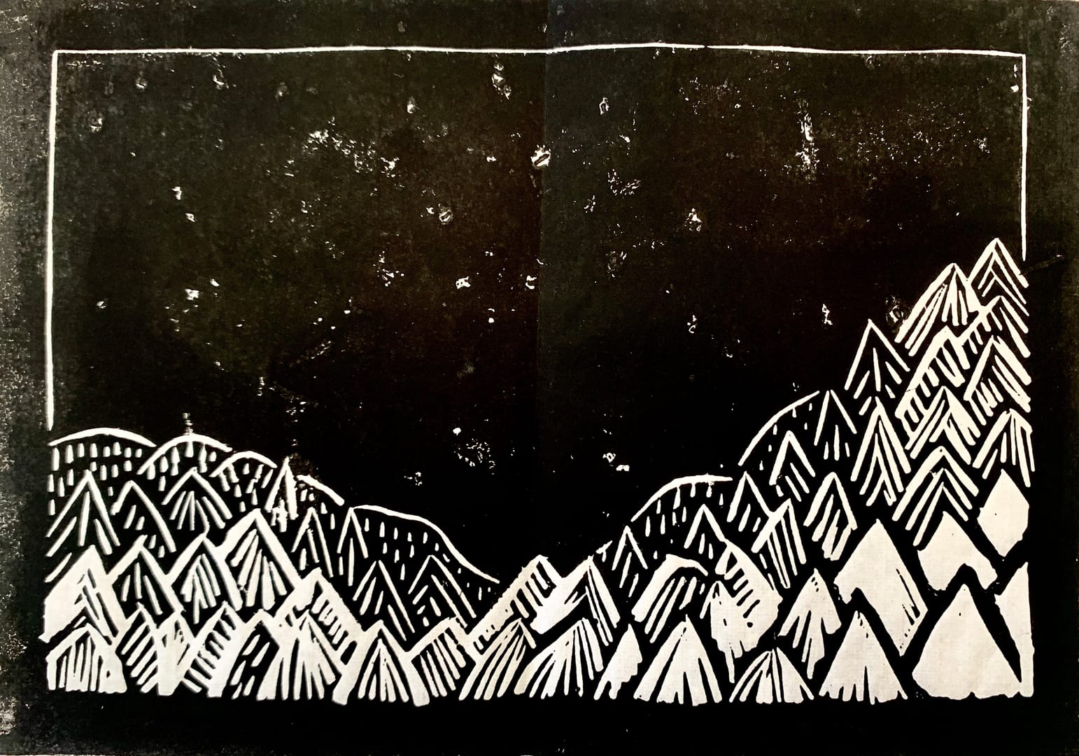
I was playing around with Japanese calligraphy paper when I printed this one. It’s not a bad composition, and I tried different styles of cutting for the trees.
But the smudges in the dark area look a little bit like “stars“. I think my fellow students were being kind to me.
This was done before I had started adding some colour, so I may reprint this to see what it looks like, without the “stars”.