
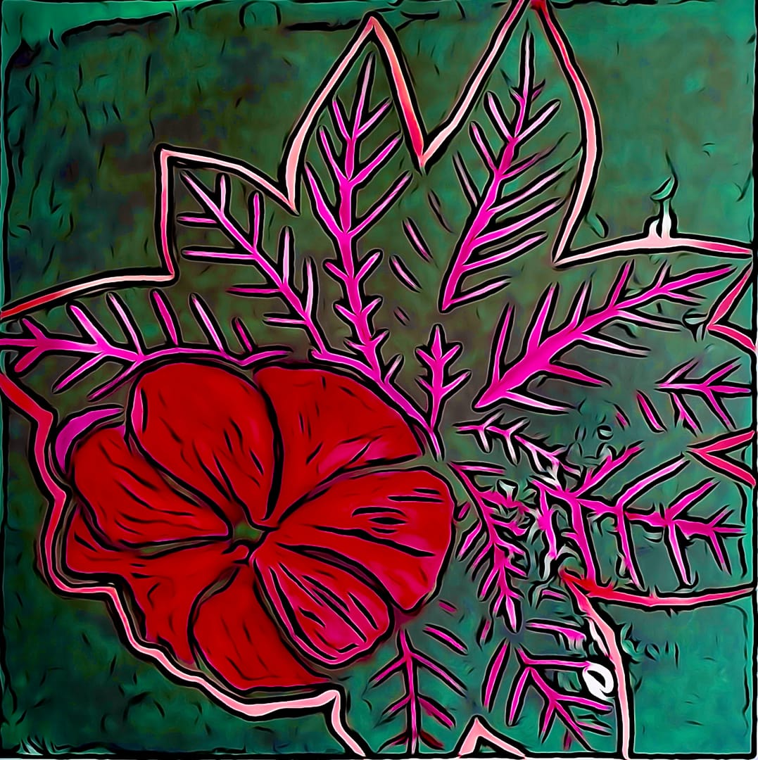
I promised the good and bad, this is definitely “less good”. I was a bit out of practice when I did it.
In the garden shade the original plant was very dramatic, deep pink red against dark green leaves.
I decided to strive for a deep green background to represent the undergrowth and just colour the petals and immediate leaves.
Like all good plans execution did not match vision.
The green isn’t dark enough except in a few places. The pink leaves should have been the petals- and the red in the petals was the colour of the leaves.
I thought about doing this again, but so far I have not.
Latest
More from the site
David Bentley
lino
0278 - 2026.04 twisted flowers
After a brief absence, I’ve done some more flowers. Technique: #lino Theme: #flower Highlight colour: #red #green Series: #garden
Read post
David Bentley
lino
0182 - 2025.05 Five flowers
Inspired by my ‘Three Flowers’ that I did for charity (0164), I expanded the concept to five, and used the same colouring. It’s part of a set hanging in a nice brown frame at home. Technique: #lino T
Read post
David Bentley
lino
0274 - 2026.03 Flower 4 block print
An experiment. Carved 4 blocks off the same design, each printed with a different colour. Lessons learned Alignment and registration Test overlap before final carve Chatter (or masking) It’s col
Read post
