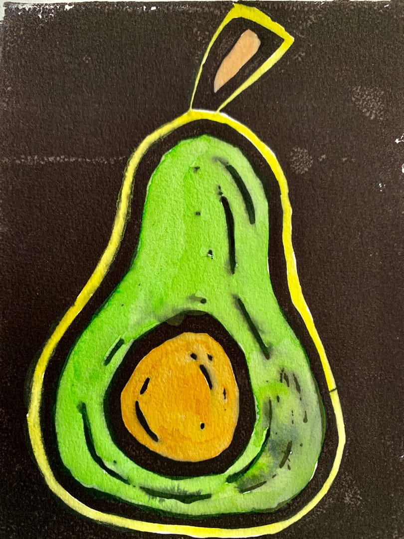
As I’m still learning and go to class, occasionally we do a class project. This one was for postcards as the size constraint, food as the topic. I did four designs, the first two were displayed.
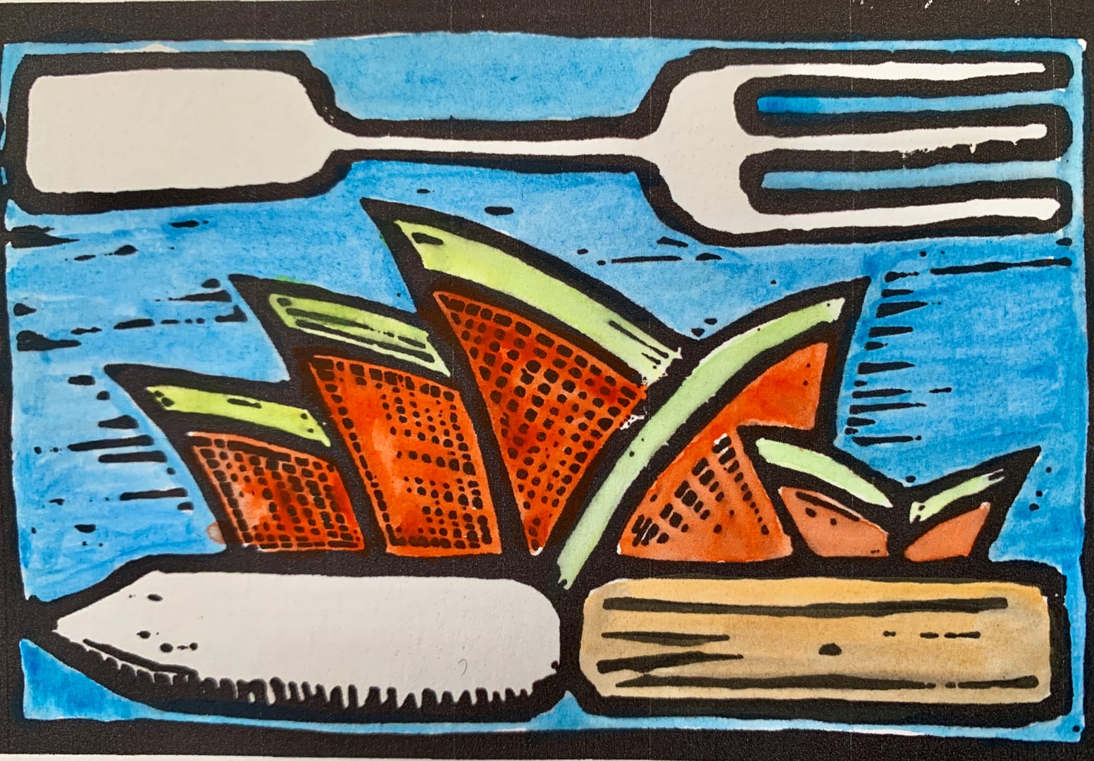
Orange segments
A play on the Sydney Opera House, which was allegedly inspired by orange segments rather than sails on the harbour. The colours aren’t quite right, but you get the idea. #lino
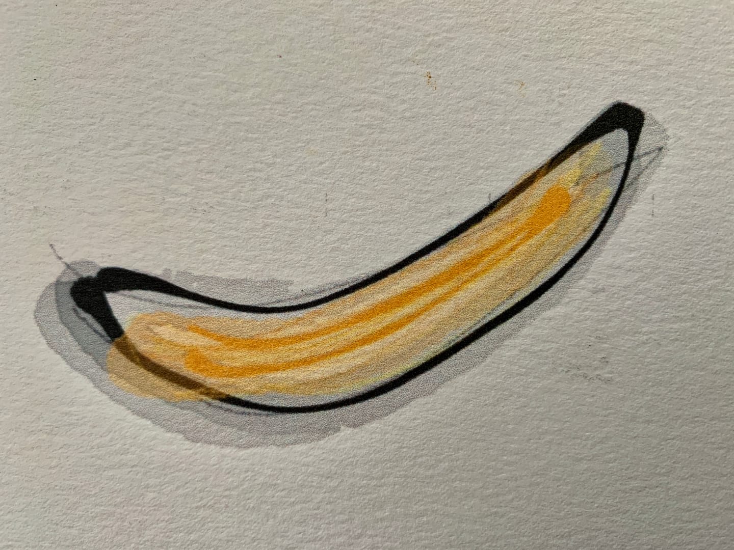
Banana
This was something I doodled on my iPhone using Memopad app. It photographs quite well. #digital
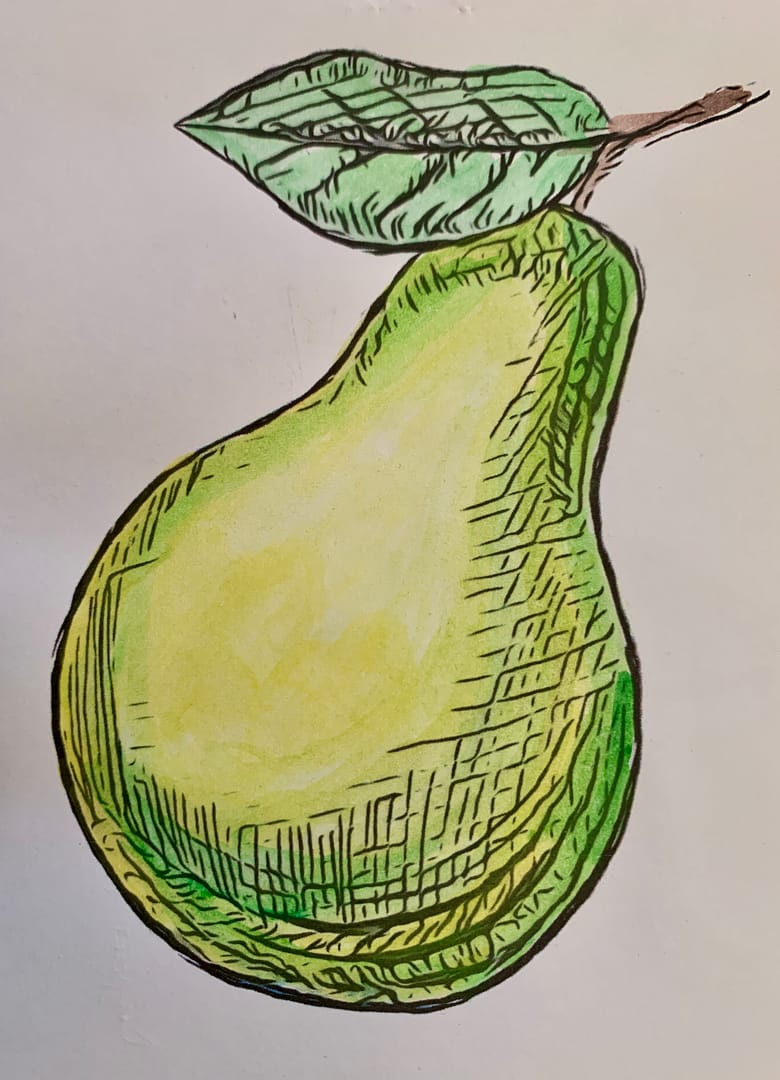
Pear
Pears, I since discovered, are a favourite of beginners drawing classes. But I just like the shape. This was an etching with a little watercolour, then photographed for printing. #drypoint_etch
Avocado
The execution here was poor, watercolour causing the Lino cut print ink to bleed. Plus I didn’t get the colours quite right. Not my best but here it is. Looks better here than it does in the flesh, so to speak.