
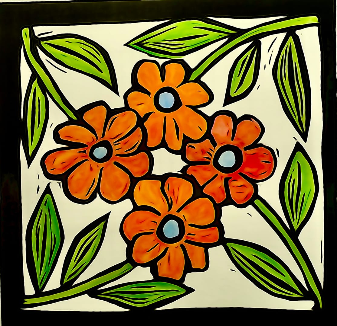
After 0147, I thought it may look nice in my lounge room, but the colours were wrong. Easily fixed! The previous print, Van Gogh’s cornfield, had faded and looked drab, but was in a very large frame that was looking for a new print.
Another print, change the flowers to blue and orange to match the cushions, re-photograph and design a poster. Off to the printers and (Bob’s your uncle) one larger poster size print later, the room was transformed.
I like this colour sachem and have plans for more.
Technique: #lino
Theme: #flower
Highlight colour: #orange
Series: #garden
Latest
More from the site
David Bentley
lino
0278 - 2026.04 twisted flowers
After a brief absence, I’ve done some more flowers. Technique: #lino Theme: #flower Highlight colour: #red #green Series: #garden
Read post
David Bentley
lino
0182 - 2025.05 Five flowers
Inspired by my ‘Three Flowers’ that I did for charity (0164), I expanded the concept to five, and used the same colouring. It’s part of a set hanging in a nice brown frame at home. Technique: #lino T
Read post
David Bentley
lino
0274 - 2026.03 Flower 4 block print
An experiment. Carved 4 blocks off the same design, each printed with a different colour. Lessons learned Alignment and registration Test overlap before final carve Chatter (or masking) It’s col
Read post
