
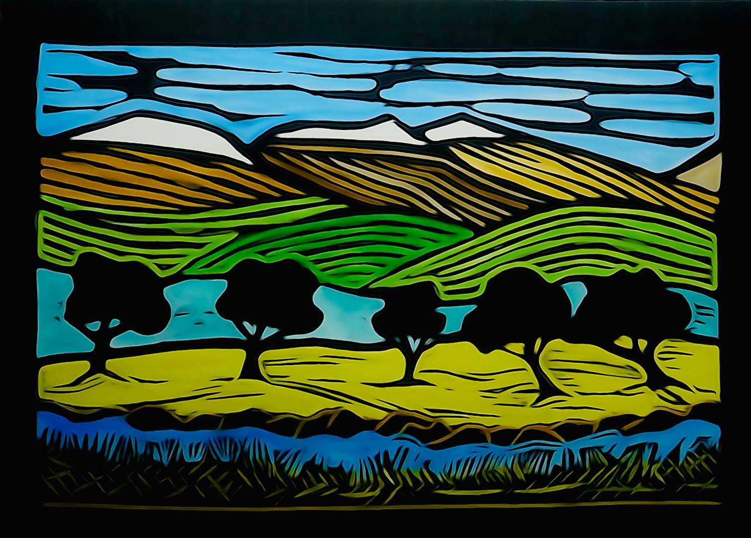
I haven’t done much Lino art over the last couple of months, so this was getting my hand back into it.
The design is based on a dream, where the dream was more vivid and better, as if often the case.
Did a single print on the press, happy with the result, so created a copy and tried gouache paints rather than my regular watercolour. Didn’t run into the black ink so much, but being thicker it was harder to apply and ran over the black in places, even when I tried a thinner brush. Doesn’t show in the photo image, fortunately.
Anyway, the photo enhancement - with saturation turned up - looks cheerful enough even if the light green behind the trees has turned a teal blue colour.
Technique:#lino
Theme:#landscape
Highlight colours: #blue #yellow #green
Latest
More from the site
David Bentley
lino
0274 - 2026.03 Flower (4 block print)
An experiment. Carved 4 blocks off the same design, each printed with a different colour. Lessons learned Alignment and registration Test overlap before final carve Chatter (or masking) It’s col
Read post
David Bentley
draw
0300 - 2026.07 edge of the world
A random idea - the best sort of - popped into my head while visiting my mother, scribbled onto a card in my pocket. I scribbled around on my phone with a few ideas before trying this out. A hand dra
Read post
David Bentley
lino
0296 - 2026.06 Fungi and Friends
After seeing little sprouts of mushroomy things rising in the grass, I thought I should do a picture on the same theme. So a simple Lino print that I did with 2 versions coloured differently. Techn
Read post
